Employers expect to see a standard, professional font on your CV and cover letter. Pick one of the recommended options below — common choices that won’t hurt your application.
What’s the best font for a CV?
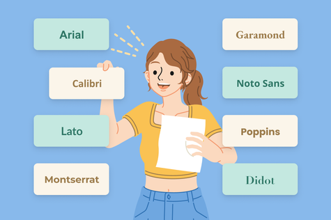
The best fonts for a CV are:
| Arial | Calibri |
| Times New Roman | Garamond |
| Didot | Lato |
| Inter | Poppins |
| Noto Sans | Montserrat |
These CV fonts are all good choices because job applicants widely use them, and employers are used to seeing them so they’ll be able to get to grips with your documents faster. Scroll down to see these fonts in action.
What’s the best font for a cover letter?
The best font for your cover letter is the same as the font you use to write your CV.
If your CV and cover letter fonts are the same, you’ll stand out to employers for your attention to detail and good eye for design.
10 best font choices for CVs and cover letters
The specific font type that you choose will influence your job application’s appearance. The 10 cover letter and CV fonts below will give your documents a professional appearance that employers will appreciate.
And to help you make the right choice, we’ve included:
- which word processors include the font
- where you can download the font (if necessary)
- which industries you can use them in
- whether each font is sans serif (straight) or serif (curly)
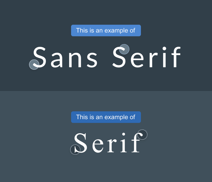
Serif fonts look more ‘formal’, while sans serifs look more ‘modern’.
A serif font is great if you want to work in a traditional industry (like banking) and a sans serif font is effective if you’re seeking a modern role (for example, in tech).
1. Arial
Arial is a basic font with many use cases, appearing early in both Google Docs and Microsoft Word.
- Font type: Sans serif
- Best industries: A wide range, from marketing to hospitality
- Available on: Microsoft Word, Google Docs, Pages
- Arial is not open source, but you can download Arimo, a similar style, from Google Fonts
2. Calibri
Calibri is another modern font that’s highly readable both on screen and in print. Calibri was first introduced in 2007 as Microsoft Office’s new default font.
- Font type: Sans serif
- Best industries: Business, Finance
- Available on: Microsoft Word, Google Docs
- Calibri is not open source, but you can download Open Sans, a similar style, from Google Fonts
3. Times New Roman
Times New Roman is a long-established serif font that was designed in 1931 for The Times in London. It’s become one of the world’s most widely used fonts.
As one of the standard fonts for CV and cover letter writing, Times New Roman is easy to read in small sizes so it’ll help you save space if you use it in your application documents.
- Font type: Serif
- Best industries: Education, Law, Public Sector
- Available on: Microsoft Word, Google Docs, Pages
- Times New Roman is not open source, but you can download Gupter, a similar style, from Google Fonts
4. Garamond
Garamond has been used in printed materials and books since the 16th century, making it one of the older fonts on this list.
- Font type: Serif
- Best industries: Law, Finance, Education, Research
- Available on: Microsoft Word, Google Docs
- Download from: Google Fonts
5. Didot
Dating from the 18th century, Didot is widely used today in high-end books, magazines, and newspapers.
Didot can give a polished touch to your job application documents. This font’s tall, elegant letters look particularly eye-catching in headings and subheadings.
- Font type: Serif
- Best industries: Fashion, Art, Design
- Available on: Microsoft Word, Google Docs, Pages
- Download from: Google Fonts
6. Lato
Lato is a sans serif font whose rounded shapes and slightly curved lines produce an elegant and professional look for an attractive CV and cover letter that employers will enjoy reading.
- Font type: Sans serif
- Best industries: Tech, Marketing, Consulting, NGOs
- Available on: Microsoft Word, Google Docs, Pages
- Download from: Google Fonts
7. Inter
Inter is a versatile, modern font known for its excellent readability on both screens and in print.
A great choice for CVs and cover letters, Inter can give your application a clean look and is suitable for a wide range of industries and employers.
- Font type: Sans serif
- Best industries: Healthcare, Product Design
- Available on: Google Docs
- Download from: Google Fonts
8. Poppins
With its curved, geometric design, Poppins is a modern font with a little extra personality.
Tall lowercase lettering makes this font easy to read even in small text sizes. As a result, Poppins is a great choice if your text is pushing your content past the recommended CV length and cover letter page limit.
- Font type: Sans serif
- Best industries: Design, Start-ups, Social Media, Lifestyle
- Available on: Microsoft Word, Google Docs, Pages
- Download from: Google Fonts
9. Noto Sans
Boasting impressive multilingual accessibility, Noto Sans was designed to correctly render characters in a vast number of scripts, including Latin, Cyrillic, Greek, Chinese, Japanese, Korean, Arabic, and Hebrew.
This open-source font was designed to be highly readable in a wide range of applications, with slightly wide yet straightforward lettering that still looks clear in small text sizes.
- Font type: Sans serif
- Best industries: Engineering, Research, Data
- Available on: Google Docs, Pages
- Download from: Google Fonts
10. Montserrat
Inspired by the Buenos Aires neighbourhood of the same name, Montserrat boasts a clean design, characterised by straight lines and circular shapes.
This font’s uppercase and lowercase letterforms are wide-set yet balanced, improving readability and contributing to a distinctive, contemporary appearance.
- Font type: Serif
- Best industries: Creative Industries, Advertising, E-commerce
- Available on: Google Docs, Pages
- Download from: Google Fonts
What’s the best cover letter and CV font size?
The best font size for CV body text is between 10 and 12 points. Subheadings (like ‘Education’, ‘Work Experience’ etc.) can be larger — normally 13–14 points is ideal.
For the header on your cover letter and CV, use a larger font size (28–35 points) for your name so it stands out, and then use a regular body text size for your contact details.
Fonts vary in width and spacing, so some fonts will take up more space on your CV even if they’re the same font size.
Experiment with making fonts slightly larger or smaller than the recommended sizes above to find the perfect look for your application documents.
In particular, serif fonts often have slightly smaller lowercase letters than sans serif fonts, so consider using a slightly larger font size if you’re using a serif font.
Top font tips
Proper font formatting makes your CV and cover letter look polished and professional — and it’s easier than you think. Here are four quick tips to help you impress your target employer.
1. Pick a more creative font for headers and a simple font for body text
A different font for your cover letter and CV headers and subheaders creates a visual contrast and showcases your design skills — a great opportunity if you’re applying for a design job.
Your name will stand out to the employer, and your CV and cover letter will be easier to skim for key information.
Aim for a cohesive look by choosing two professional fonts that complement each other.
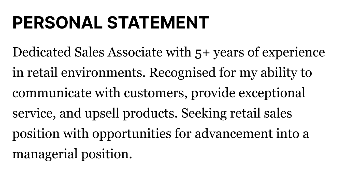
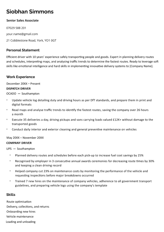
For example, choose a sans serif font (like Lato) for your CV and section headers and a serif font (like Times New Roman) for the main text.
The sans serif headers will make your cover letter and CV format look clean and well-structured, while the serif body font will emphasise your professionalism.
Here’s an example of how that could look:
2. Bold or italicise section headings
Bold or italicise section headings and other key information to make them stand out and ensure your CV is easy to navigate for recruiting managers.
One good approach is to bold the start of each work experience and education entry (normally the job title/university name) to improve readability.
You can also use italics when you include additional information within a work experience or education entry (for example, you add a relevant modules header to your CV education section).
Cover letters don’t usually have headers to format. But you can try bolding the date, the cover letter greeting (for example, Dear Ms Jones,) and your name in your sign-off to provide a clear structure and a pleasant contrast to regular paragraph text.
3. Stick to subtle font colours
Black looks most professional on CVs and cover letters, especially for body text. But if you want to add a little colour to your application, then try changing the font colour of your CV and section headers.
Pick darker colours like navy blue or maroon. Purples, pinks, and pastel colours will look unprofessional.
4. Use an AI builder that picks and formats the best fonts for you
Is your head spinning from all the font choices and formatting tips we’ve presented?
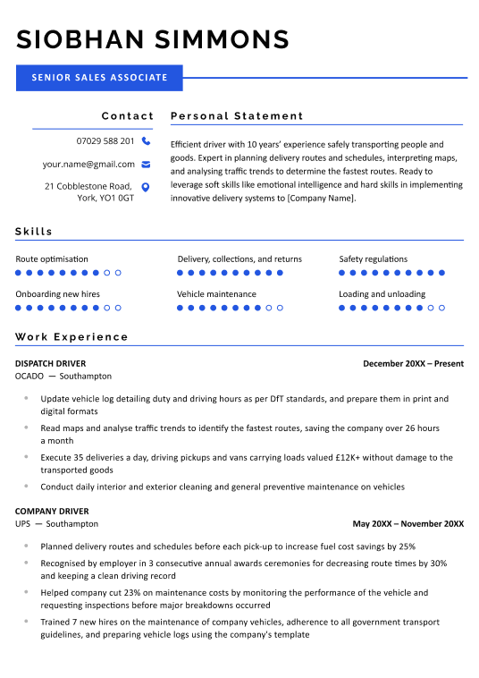
An easier option is to use an AI-powered CV builder that offers CV template choices with fonts optimised for readability by professional designers.
Skip the writer’s block and make a CV in minutes with our AI software.
Frequently Asked Questions
Here are expert answers to some of the most common questions about picking a professional font for your CV and cover letter:
1. What fonts should I avoid using for my CV and cover letter?
Avoid using any fonts that are difficult to read. For example, stylised fonts designed to look like joined-up writing are a no-no because they’re difficult to read.
There’s no set rule for determining whether a font is professional or not, but you should be able to tell at a glance. If you’re in any doubt, just use one of the 10 fonts we recommend above.
2. What’s the best cover letter spacing?
The best cover letter spacing is 1–1.5 spacing between lines both for your CV and cover letter. Double-spacing makes your document look like a university essay (ie., unprofessional), while anything below single-spaced makes your text crammed together and difficult to read.
As for your CV and cover letter margins, set them to 1.27–2.5 cm. Usually, the default margins in your writing software are fine, but you can make them larger to make the page appear full or shrink them to fit extra text on the page.
3. What are some good font pairings for a CV or cover letter?
Here are some good font pairings our designers use to make professional CV and cover letter templates:
- Lato (for headers) and Poppins Light (for body text)
- Montserrat (for headers) and Muli (for body text)
- Times New Roman (for headers) and Calibri (for body text)
4. Do I need to use the same font size on my cover letter and CV?
It’s best to use the same font size on your cover letter and CV. Employers will read both application documents at the same time, so they’ll notice a big difference in font sizes between the two — and they may wonder if you did so to make up for a lack of content.
However, a .5-point difference is small enough that most readers won’t notice.
5. What font is used for academic CVs?
Academic CVs can use any professional font. Garamond is a good choice because it’s used in many textbooks and fits well in an academic context.




Copy Link
Facebook
Linkedin
Twitter
Pinterest